#productdesign
#web
#Figma
#SaaS
Challenge
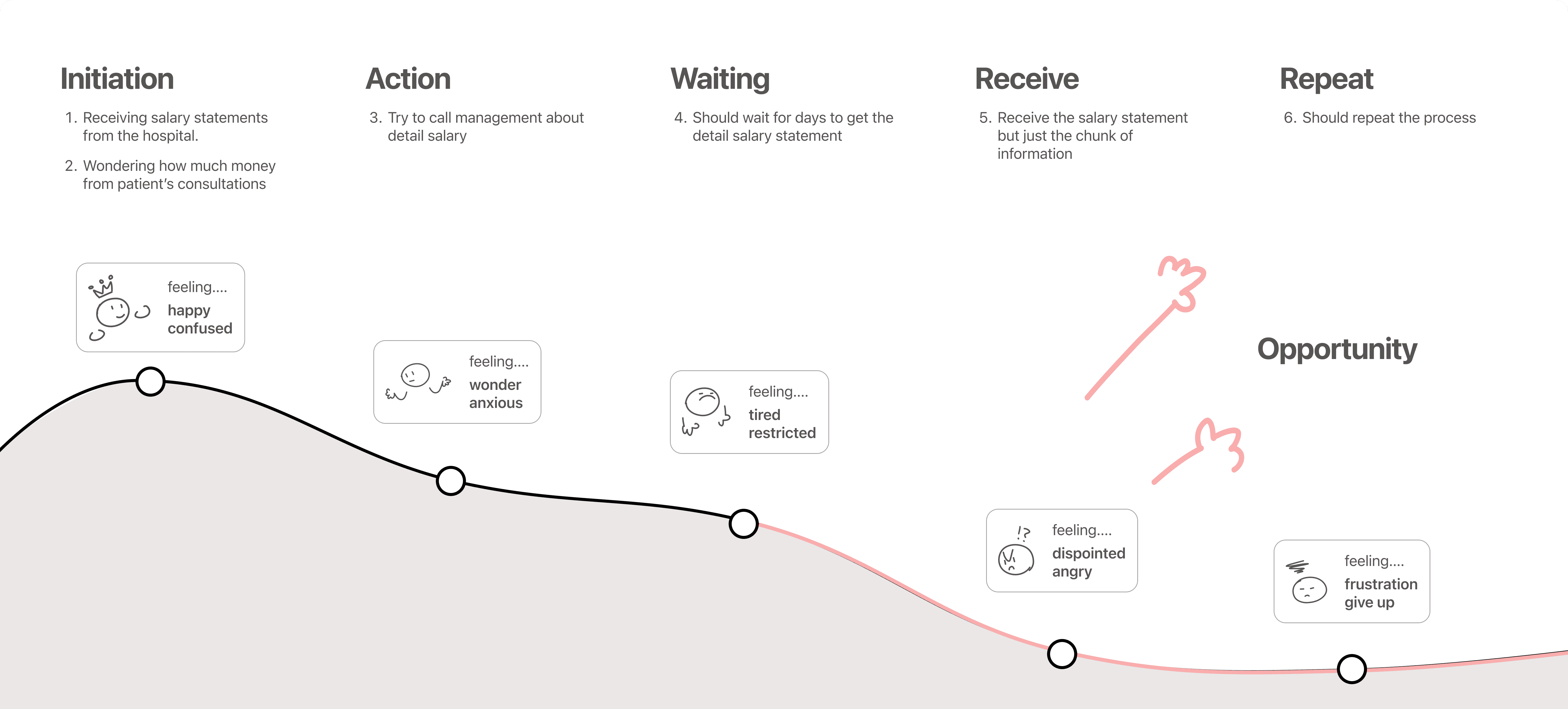
Due to time constraints and relying solely on literacy research, rather than direct interviews, our understanding of users may be limited. Nonetheless, We have strived to derive the best possible solution based on available insights from the product team's brief.
Solution
Introducing "Doctor's Finance" in NOTES, a specialized tool designed for doctors to gain detailed insights into their income and facilitate comparisons across various variables.
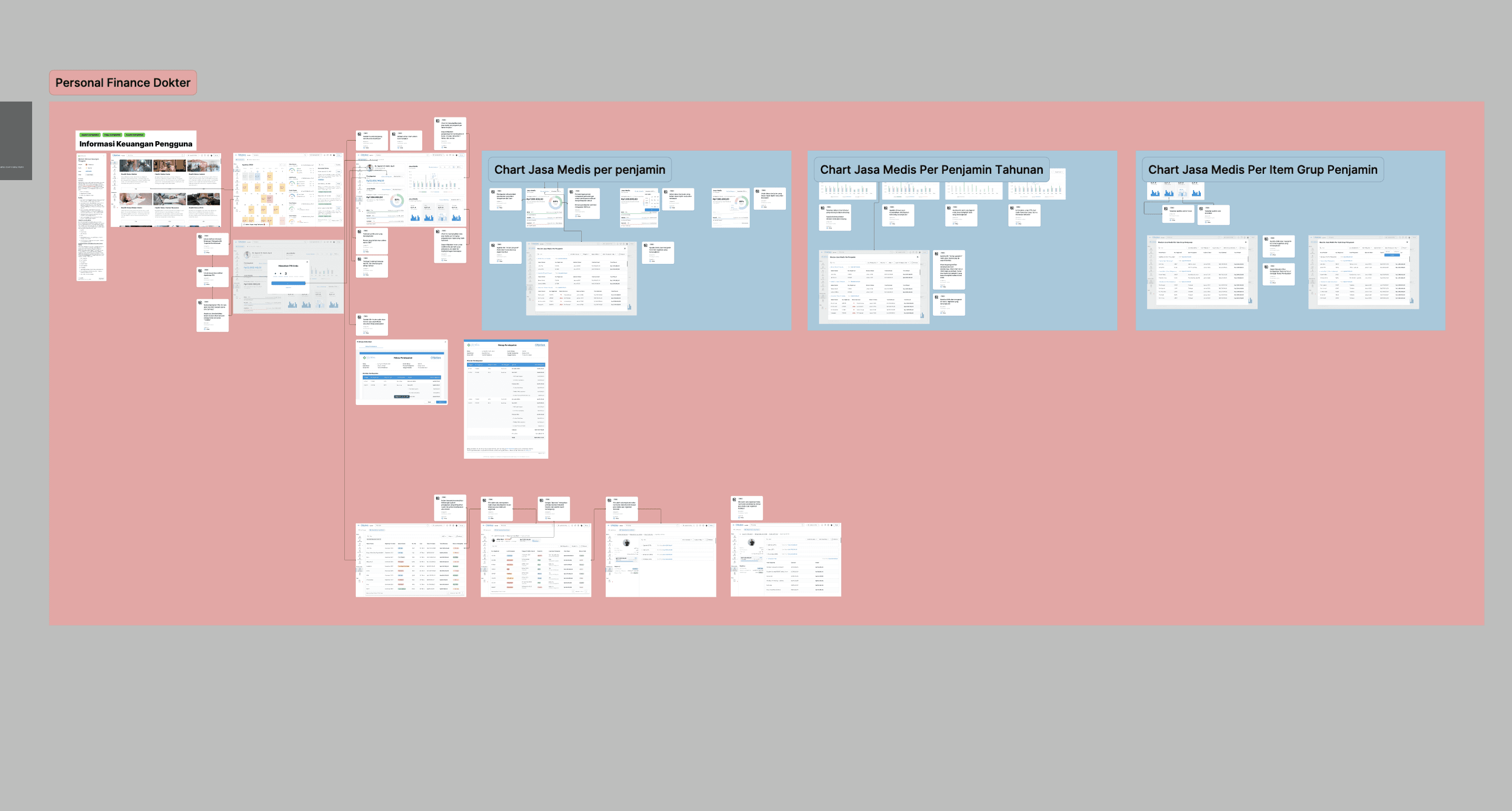
Design Process
Design Decision 1
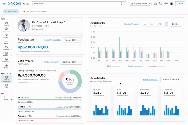
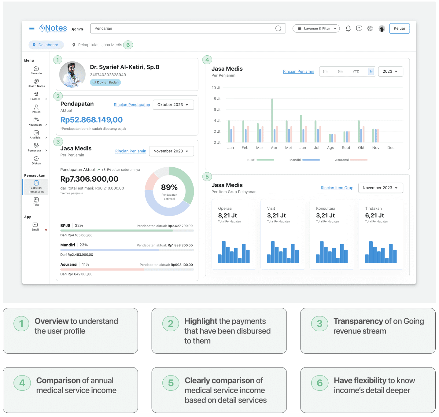
Dashboard
Designing commenced with the dashboard. Given our priority to expedite delivery, the dashboard serves as a centralized hub where users can quickly assess multiple aspects at a glance. We strategically placed key elements, such as user profiles and income numbers, on the left side to align with the F and Z patterns of human reading behavior, ensuring users notice them first.
Design Decision 2
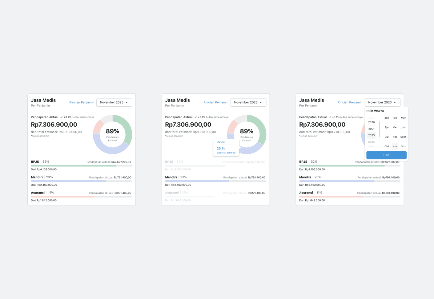
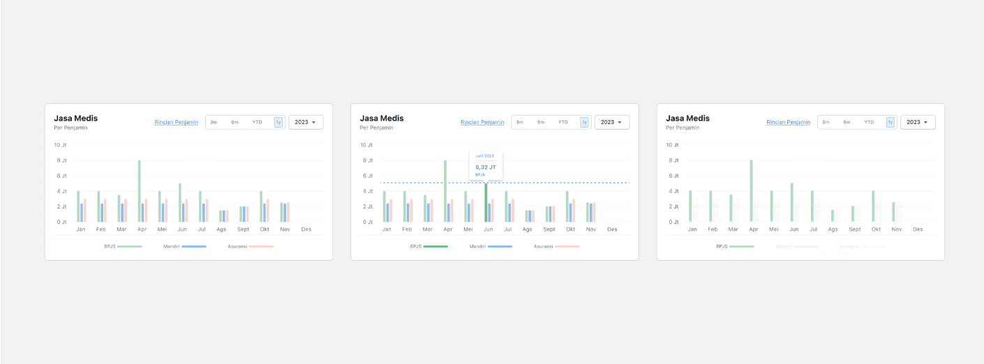
Dynamic Chart
One component we developed for doctors to track their income utilizes a donut chart to compare the expected income with the actual income received also another variables related. Our focus was on effectively representing the numbers that users want to see, which is why we implemented a hover state to enhance focus and interaction with the data.
Design Decision 3
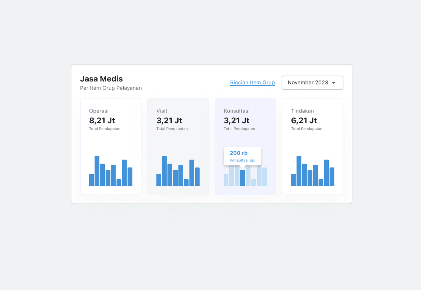
Detail Data Visualization
We created a separate page from the dashboard to provide detailed information based on patient names. My primary consideration was to prioritize the user's focus, allowing them to choose between viewing details based on common variables or specific patient names.
Design Decision 4
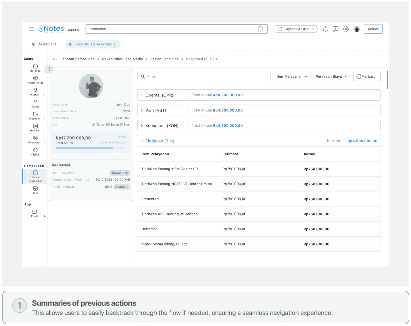
Keep on Track
To facilitate deeper exploration, We designed a system with clear step indicators and summaries of previous actions, enabling users to easily track their progress and backtrack as needed.
Final Design
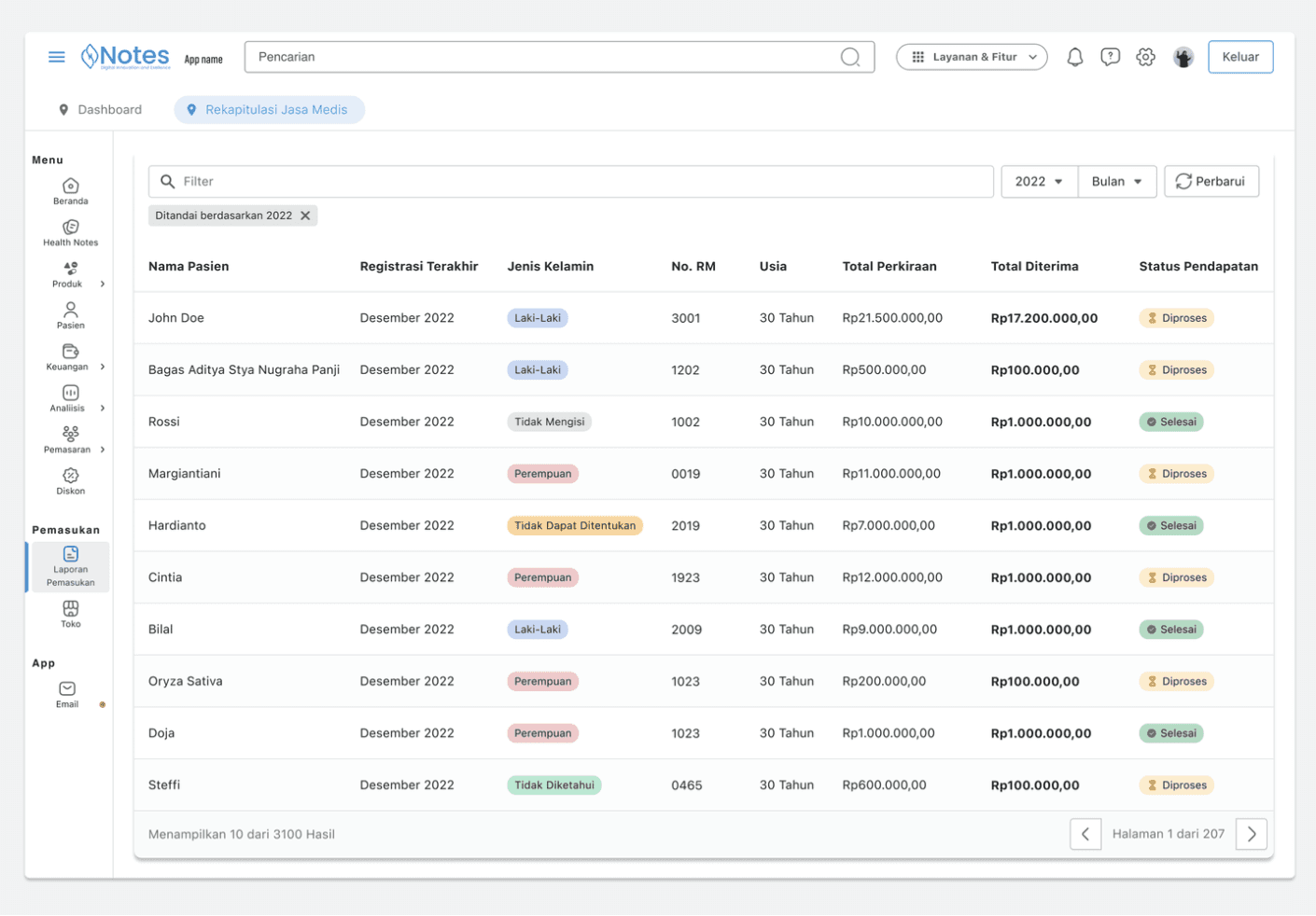
Doctor’s can now see their income and also the details at once glance. The first MVP includes features that allow them to print out the income statement by themself.
Doctors also have the ability to monitor income details for each patient by accessing their individual profiles. This feature allows doctors to review payment histories, services rendered, and outstanding balances associated with specific patients, facilitating comprehensive financial management and patient care.

Design Handoff
We created handoff documents to our engineer providing details by providing annotations for every screen that requires context and organized them into flows to streamline their understanding. We also worked closely with them to make sure they understand the details throughout the process.
Figma
Figjam
React
Jira
Key Takeaways
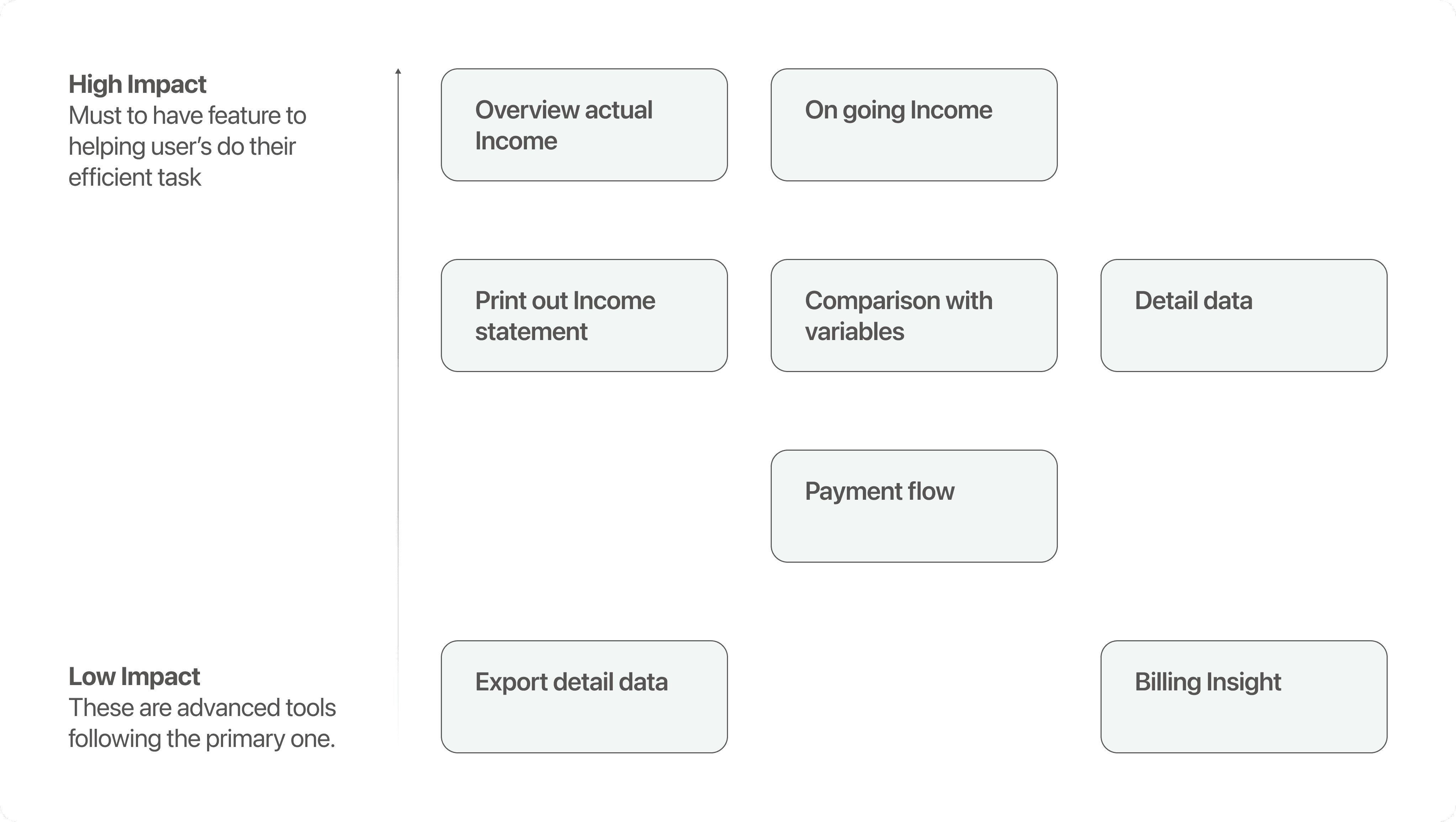
Focus on the core user job, and reduce cognitive overload by removing other actions (detail patient payment) that are not the core user job (overlook income statement)
While we believe the current design is an improvement over the conventional approach, we are certain there are still numerous opportunities for refinement to achieve optimal usability and effectiveness. As the product is still in development, we are unable to share all the detailed information at this stage.